Candlestick Charts: What They Show, and What They Cannot Tell You
Candlesticks compress four prices into one shape and are genuinely useful for reading a market. The pattern-recognition industry built on top of them is far less well supported.
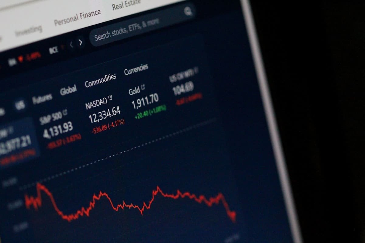
A candlestick chart compresses four numbers per period into a single shape. It is an efficient way to represent price information, and reading one properly is a genuinely useful skill.
The large industry of pattern names built on top of it rests on considerably weaker foundations, and it is worth separating the two.
Anatomy of a candle
Each candle covers one time period — a minute, an hour, a day — and encodes four prices:
- Open — the first traded price of the period
- High — the highest reached
- Low — the lowest reached
- Close — the final price
The body spans open to close. The wicks extend to the high and low.
Colour shows direction: conventionally green or white when the close is above the open, red or black when below.
What the shape communicates
The proportions carry information about the balance within the period.
| Shape | Structure | Reasonable reading |
|---|---|---|
| Long body, short wicks | Sustained directional movement | One side controlled the period |
| Short body, long wicks | Wide range, little net change | Contested, no resolution |
| Long lower wick, close near high | Sold off, then recovered | Buying appeared at lower levels |
| Long upper wick, close near low | Rallied, then faded | Selling appeared at higher levels |
| Almost no body (doji) | Open and close nearly equal | Balance, indecision |
Note the framing. These describe what happened during the period. They do not state what happens next, and the distinction matters more than anything else in this article.
The pattern industry
Dozens of named patterns exist — hammers, engulfing candles, morning stars, three white soldiers. The literature around them typically presents each with a stated implication and a reliability rating.
The evidence is considerably weaker than that presentation implies.
Academic studies testing candlestick patterns systematically find limited predictive power once transaction costs are included. Results are frequently not robust across different markets, different periods or different parameter choices. Broader surveys of technical analysis find that early positive results in some markets have generally weakened over time, consistent with any genuine inefficiency being competed away once it is widely known.
That does not mean chart reading is worthless. It means the specific claim — that a named three-candle formation reliably predicts direction — is not well supported.
Why patterns appear to work
Three mechanisms explain the persistent belief.
Selection in hindsight. Scrolling back through a chart, you find the pattern where it preceded a move. The identical pattern where nothing followed is not salient, and there are far more of those.
Vague definitions. Many patterns lack precise criteria. How long must the wick be relative to the body? How close must the close be to the high? Without exact rules, identification becomes flexible enough to fit whatever happened.
Multiple comparisons. With dozens of patterns across multiple timeframes, something will always be present. Some of those will precede moves purely by chance.
The honest test: define a pattern with precise numerical criteria, apply it mechanically to historical data across several markets, include realistic costs, and measure. Almost nobody promoting patterns has done this, and where it has been done the results have generally been unimpressive.
What is more defensible
Some chart-derived observations have better support, largely because they reflect real market structure rather than shape recognition.
Trend. The tendency for price movement to persist somewhat is one of the more robustly documented effects across asset classes, and it appears in academic research as momentum rather than as a chart pattern.
Support and resistance around obvious levels. Prior highs and lows, round numbers, and prior session extremes attract order clustering — because many participants place orders there. This is a self-referential effect but a real one.
Volatility regime. Whether ranges are expanding or contracting is directly observable and informative for position sizing, regardless of direction.
Volume confirmation. A move on unusually high volume reflects more participation than the same move on thin trading.
Choosing a timeframe
Lower timeframes are attractive because they produce more signals. That is precisely the problem.
Over one minute, price movement in a liquid market is dominated by order flow mechanics rather than by information. There is very little to extract, and each signal acted upon pays a spread. The ratio of noise to signal rises as the timeframe falls, while costs rise with frequency.
Daily and four-hour charts filter more noise, generate fewer decisions, and are consistent with the finding that lower trading frequency correlates with better outcomes.
Using charts sensibly
Read them as a record, not a forecast. A chart tells you what has happened and where participants have transacted. It is descriptive.
Combine with context. A technical level means more when it coincides with something — a policy meeting, an earnings release, a data print.
Define anything you rely on numerically. If a signal cannot be stated precisely enough to be tested, it cannot be evaluated, only believed.
Test before trusting. Apply the rule to historical data with realistic costs. Most rules do not survive this.
Never let a chart determine size. Position sizing derives from risk limits, not from how convincing a formation looks.
The bottom line
Candlestick charts are an efficient and useful way to see what a market has done. Learning to read them properly — range, close position, the balance within a period — is worthwhile.
The elaborate taxonomy of named patterns is a different proposition, and the evidence supporting it is thin. Treat charts as a description of what happened, be sceptical of anything presented as a reliable signal, and remember that the profitable part of trading is risk management rather than pattern recognition.
This article is educational and is not financial advice. Trading carries a high risk of loss.
Frequently asked questions
What do the parts of a candle represent?+
The body spans the open and close prices, and the wicks show the highest and lowest prices reached during the period. Colour indicates direction — conventionally green or white for a close above the open, red or black for below. Four data points in one shape.
Do candlestick patterns actually work?+
The academic evidence is mixed and generally weaker than the popular literature suggests. Studies testing patterns systematically find limited predictive power once transaction costs are included, and results are often not robust across markets or time periods. Candlesticks are more defensible as a way to read what happened than as a signal generator.
What is a doji?+
A candle where open and close are almost identical, producing a very small body. It indicates that buyers and sellers finished the period roughly balanced despite whatever range occurred. It is often described as a reversal signal, but on its own it mostly indicates indecision, and its meaning depends heavily on where it appears.
Which timeframe should a beginner use?+
Longer ones. Lower timeframes contain proportionally more noise and generate far more signals, most of which are meaningless, while multiplying transaction costs. Daily and four-hour charts filter noise and require fewer decisions, which suits both the evidence and most people's available attention.
Sources and further reading
Risk warning
Trading cryptocurrencies, forex and leveraged derivatives involves substantial risk of loss and is not suitable for every investor. Our content is journalism and education — never personalised financial advice. Full disclaimer.
Written by
NiazFounder and writer
Niaz founded Trading News Global and writes for it. He started the site to explain how markets actually work — the mechanism behind a headline rather than a view on where a price is going — after finding that most retail-facing financial coverage does the opposite. He sets the site's editorial position: primary sources over secondary reporting, no price targets, no trading signals, no affiliate links and no paid coverage. Responsibility for everything published here, including the mistakes, is his.
Edited by Harry Wilson, who reads every article against the editorial policy before it is published.